Themes
From App Builder v1.10, you can choose between different theme options or create a custom one for your app. The themes are available in edit mode when selecting the Options tab and navigating to the Theme Options section.
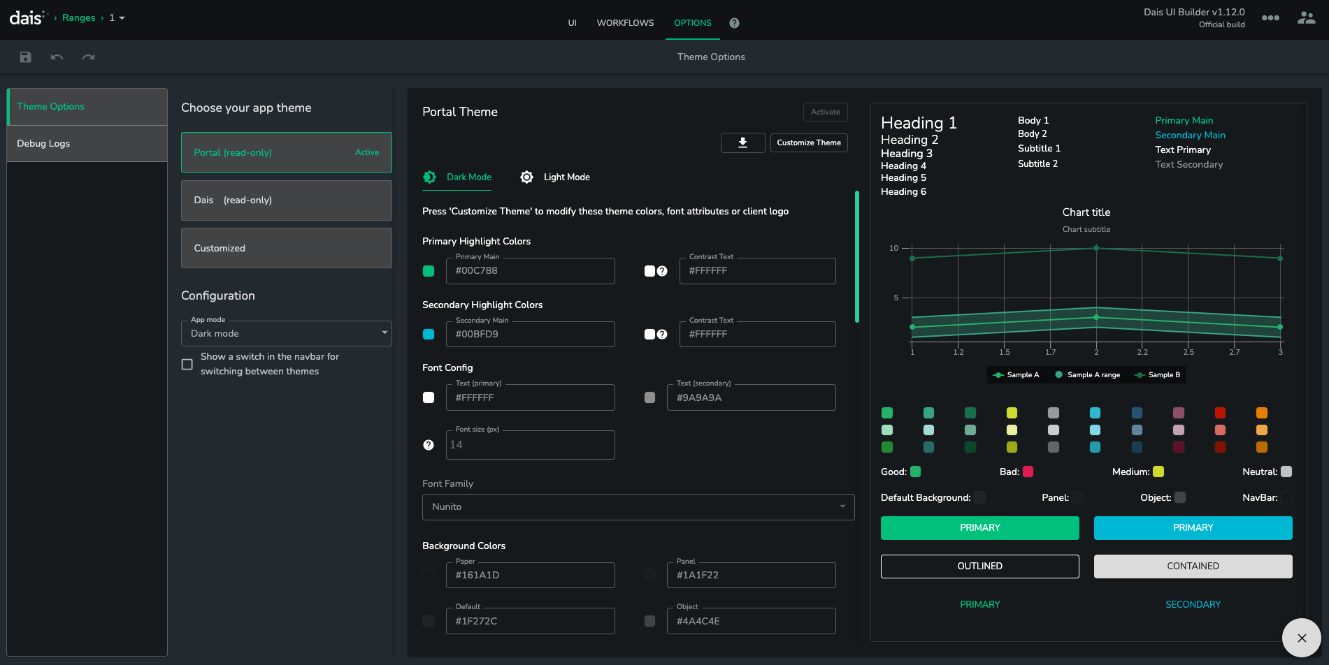
Actions
Activating Themes
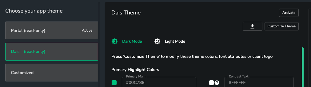
The Portal theme is active by default. In order to choose a different theme for your app, choose the app you wish to use and click on the Activate button located on the top-right corner of the theme options panel.
Customizing Themes
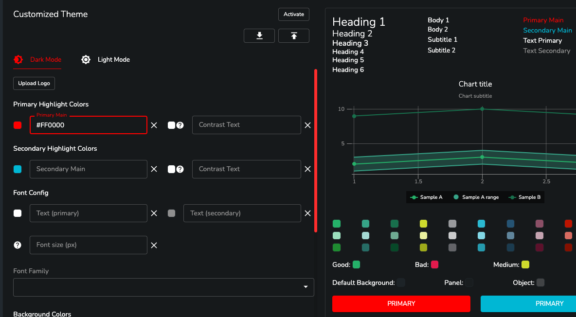
Apps support custom colors, fonts, chart config. For example, in order to customize the primary color, choose the Customized theme, click on the Primary Main text box and enter a new color. The supported types are HEX (e.g. #FF0000), RGB (e.g. rgb(255,0,0)), RGBA (e.g. rgba(255,0,0,1)), and plain text (e.g. 'red'). All but RGBA colors are automatically converted to HEX values.
Adding a Custom Logo
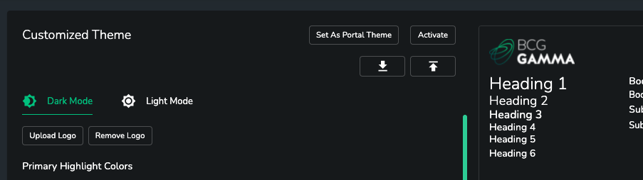
Upload a logo for a theme that will appear on the navigation bar when the theme is activated.
Upload/Download Theme
Click on upload/download buttons to export the selected theme or upload a new custom one.
Copy a Pre-Defined Theme
When selecting a read-only theme click on the Customize Theme button in the action panel to copy it over to the Customized theme. Note that the custom theme inherits from the portal theme by default.
Setting the Portal Theme
Portal admin users are able to set a theme to be the default portal theme. This sets the uploaded logo as well.
Chart Colors
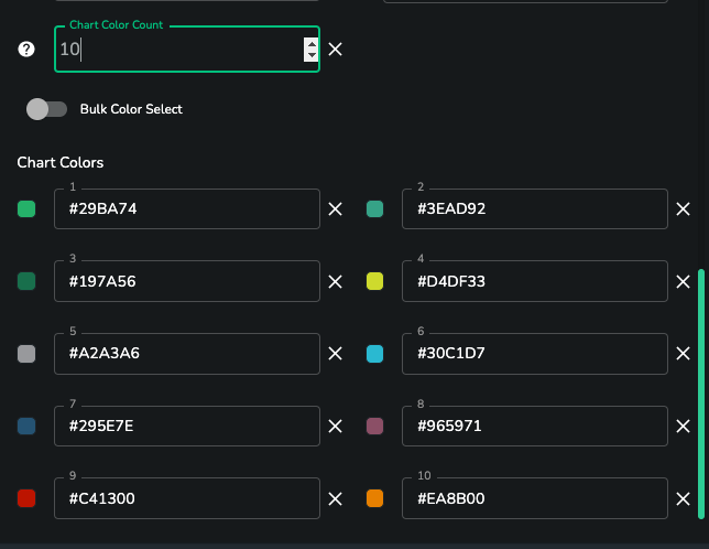
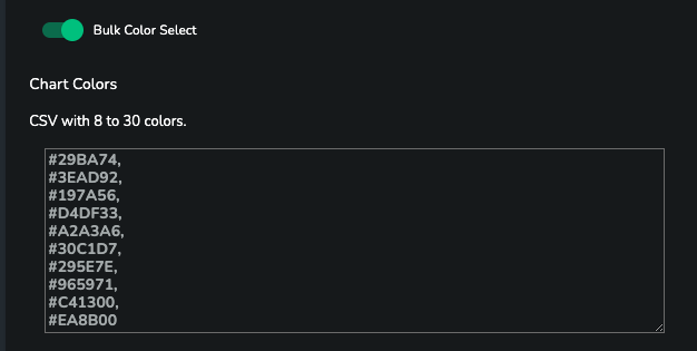
Define 8-30 custom chart colors in 2 different ways:
- selecting the count and the colors manually.
- using the bulk selector where you can copy and paste several colors at once.
Configuration
- From App Builder v1.9, you can configure your app to use either dark mode or light mode. You can also show a switch to the end-user which allows them to easily swap between dark/light.
- In App Builder v1.10 the configuration was moved to the Options -> Theme Options section.
Dark & Light mode
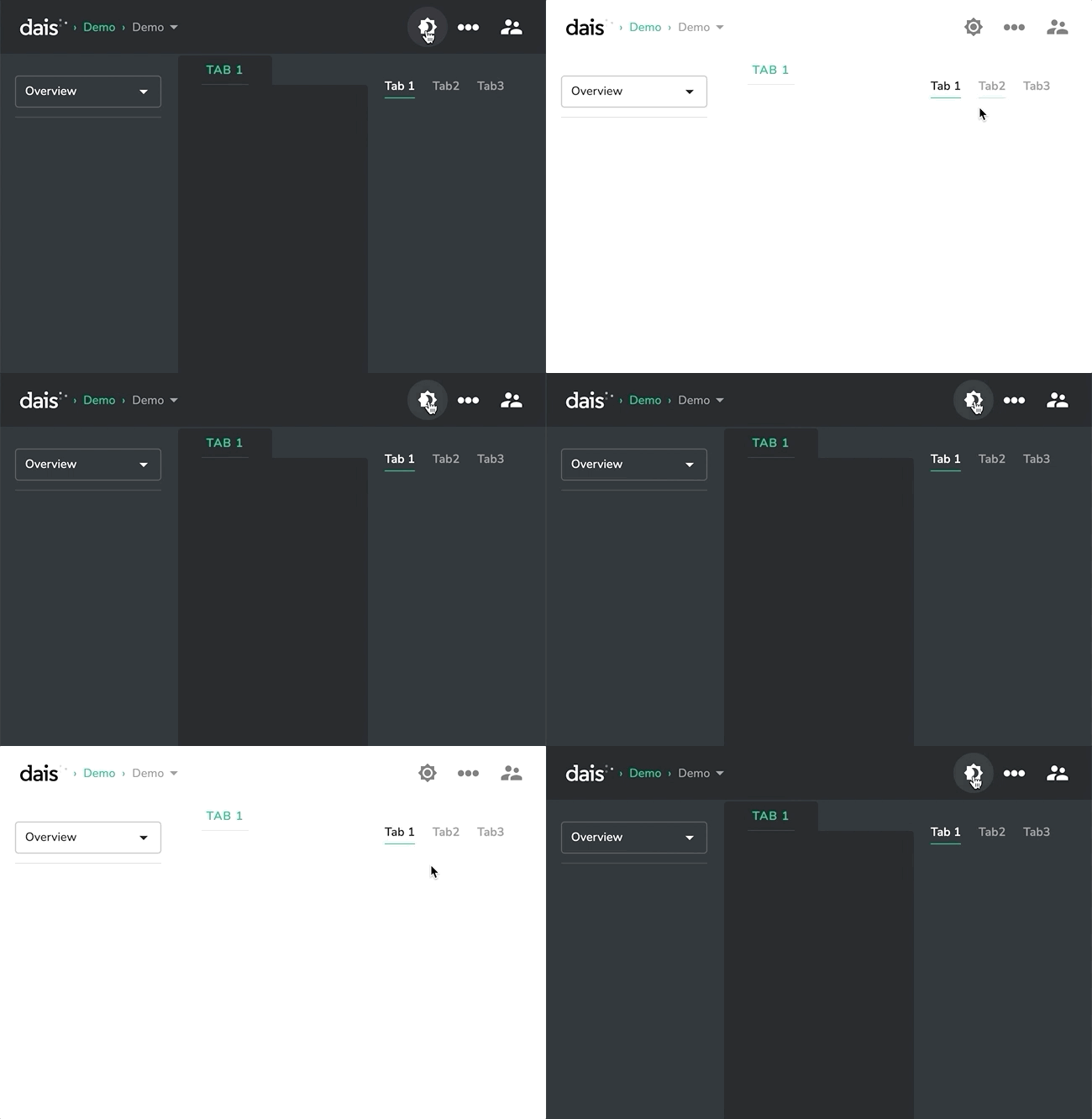
Configuring Dark/Light Mode
To configure the dark/light mode behavior in your app, first select the Theme Options section in the Options tab:
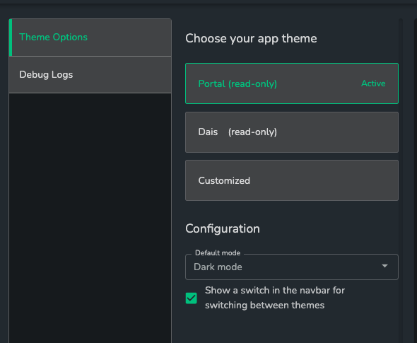
Here, you will see 2 different configuration options available:
Default mode- this defines what theme is used when the app is first openedShow a switch in the navbar for switching between themes- disabled by default. Enable this to show the dark/light mode switch to the end-user
Note: Component not compatible with the light mode theme
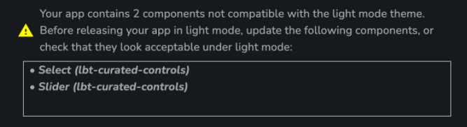
Some components are not yet compatible with the light mode theme, and cause a warning to be shown. If you are seeing this in your app, the most likely cause is that your app is using an old version of the specified components. In this case, you should contact the Dais team to get the most up-to-date version of the component, and the warning should go away.
In cases where a new version of the component isn't yet available, you can still enable light mode. However, you should ensure that the component looks acceptable under light mode. If it does not look acceptable, you should not enable light mode in your app.